Studies III 2006-20013
Color Photographs [The World As A Book]

Introduction July, 2013
This collection of miniature color photographs is the third project under the broad title, Studies. The first project, Studies I 1994-2000 consists of small, square, snapshot-sized black and white gelatin silver photographs inspired by brief compositions for solo piano. Studies II : Monk's Quirky Music 2011 is a visual tribute to the great jazz composer and performer Theolonius Monk, consisting of "quirky pictures" selected from the first Studies I project.
*
In early June, 2013, after completing the large, two year project "An Imaginary Book" 2011-13, I began wondering what direction my photography would take next. I felt compelled to look back at the earlier Studies projects for inspiration. Studies is one of my most favorite projects, in part because I enjoyed the spontaneous, playful approach I took in making that work. As I contemplated the two Studies projects it occurred to me that they contained only black and white images. I wondered what making a third Studies project, this time in color imagery, might be like.
I had purchased a digital camera in 2006, and since then have been making color photographs, mostly for very specific projects I was working on, or for snapshots when we would travel. I looked back at all the work I had hidden away in digital file folders since 2006 and discovered many interesting photographs that either I had never used or really seen because of being preoccupied with other project interests. These neglected images now seemed to to be longing for my recognition: thus Studies III, Color Photographs was born. All the images you will see here were made between 2006 through June, 2013.
I have included below a few comments about this work. And at the very bottom of this project page I have provided an explanation of the project's subtitle [The World as a Book].
Welcome to Studies III, Color photographs 2006-20013.
Steven D. Foster
July, 2013
*
The Photographs
Click on images once, twice, to enlarge
Studies III Color #1 Butterflies and oranges 5x5"
Studies III Color #2 Dead Fish on the bottom of a stream bed
Studies III Color #3 Antlered Animal and Chandelier
Studies III Color #4 Figure and Bus Lights
Some thoughts about the color Studies
The Miniature, Square Format The miniature scale of the Studies photographs, and the square format, were important, liberating disciplines for the wok in the earlier Studies Projects; and I have carried these concerns as much as possible into my selection process for the the present project, the Color Studies. I encourage you to read my introductory texts for the earlier Studies projects.
The colored photographs you see here were cropped to a square from the more familiar digital rectangular format. When photographing the square format has forced me to be direct and straightforward in both my seeing and the presentation of the image; it generally requires that the composition be related more to the center of the frame rather than to the edges. And because the square insists on a concentrated approach to seeing and pictorial form the pictures tends to be more about the relationship between the viewer and the picture, or the viewer and the things centered in the picture, rather than about relationships between things in the frame. Though these pictures were not made with the intention of being transformed into miniature square photographs, the selection process for this series has certainly been determined by these formal dynamics.
The colored photographs you see here were cropped to a square from the more familiar digital rectangular format. When photographing the square format has forced me to be direct and straightforward in both my seeing and the presentation of the image; it generally requires that the composition be related more to the center of the frame rather than to the edges. And because the square insists on a concentrated approach to seeing and pictorial form the pictures tends to be more about the relationship between the viewer and the picture, or the viewer and the things centered in the picture, rather than about relationships between things in the frame. Though these pictures were not made with the intention of being transformed into miniature square photographs, the selection process for this series has certainly been determined by these formal dynamics.
Also, the miniature scale of the work has affected the way I chose images for inclusion this project. Based on the work I did for my earlier Studies projects I knew that the primary events, forms or subject matter photographed needed to be easily seen in the smaller image format. Thus the forms needed to be large, and presented in a relatively simple, direct, visually dynamic structure.
Fredrick Sommer, the great modernist photographer and philosopher, said our primary empathy is to structure which content reveals. I think in general he's right about this, though the concept is very abstract and thus making how to talk about the meaning of pictorial structure very difficult. I suspect structure relates in some basic way to the idea of archetypal form.
In an online presentation such as this, image scale is not a very dynamic issue for the viewer. To some extent you can adjust viewing size yourself with clicking on the image or zooming in and out with your computer. However if I were to print and frame the color studies for exhibition I imagine I would make the prints 5 to 7 inches square, and present them in 12 to 16 inch square frames.
Studies III Color #5 Healing Trinkets
Studies III Color #6 View from Bus window Blue Haze
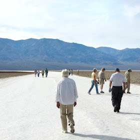
Studies III Color #7 Death Valley
Studies III Color #8 Escalator
Studies III Color #9 Breakfast gestures and map
Some additional thoughts
Intuition, Spontaneity & Color What I loved about the two earlier Studies projects was the freedom I felt while doing the work. The pictures were made very spontaneously, without thinking much. The process of working intuitively defined the content of the project. As the body of images spontaneously unfolded over time I would discover thematic groups that had been forming of their own volition based for example in recurring subject matter, formal and technical issues, conceptual themes, etc.
For the Color Studies, of course the work was already given; it was more a matter of finding and selecting the images from within a collection of images that had accumulated over a six-to-seven year period. Aside from the formal concerns I have already written about, color became a primary issue in terms of my choice of image, and how I adjusted the colors for final presentation online, plus how I placed the images within the sequential presentation.
The color in some images is very subtle, almost monochrome; or in others garish or very saturated. The color can function as realism and at other times in an "atmospheric" or impressionistic way. Color can be a formal, structural element, or the primary event in the image. I have in fact adjusted the color of some images so that the visual transitions between images in the sequence is more coherent or poetically logical or intuitively meaningful. Sometimes I have used an abrupt color transition between images to announce a new thematic direction in the sequence.
The selection and formal adjustments of the Color Studies has been a new creative process for me. I feel it has been an important preparatory work for whatever will be coming next.
Click on images once, twice, to enlarge
Studies III Color #11 Bird In Tree
Studies III Color #12 Bull Billboard, Spain
Studies III Color #14 Bus View, Turkey. Rear View Mirror
Studies III Color #16 Underground Cave Air Vent
Studies III Color #17 Chair, Sunlight, Fence
Studies III Color #18 Truck In Front of Buss, night view
Studies III Color #19 Night Club, Istanbul
Studies III Color #20 Ancient Pots, Museum Display
Studies III Color #23 Hanging Garlics
Studies III Color #24 Hanging Paper Globe Light
Studies III Color #25 Cowboy With Rope Sculpture
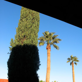
Studies III Color #26 Three Trees One Shadowed
Studies III Color #27 Underground Cave, Face
Studies III Color #28 Chair With Shadow
Studies III Color #29 Tree Shadow, Green River
Studies III Color #30 Italy, Church Sculpture Portrait
Studies III Color #31 Black Plastic Spoon
Studies III Color #32 Green Garage Wooden Peg
Studies III Color #33 Wall Abstract, Graffati
Studies III Color #34 Aluminum Tarp with cut holes
Studies III Color #35 Motorcycle, Mirrors, Leather Jacket
Studies III Color #36 Chair, Tree, Lake View
Studies III Color #38 Sculpture Portrait of Man
Studies III Color #39 Stone on Aluminum Table
Studies III Color #40 Tourists Climbing Rocks
Studies III Color #41 Stone Ruin Fragment Green Grass
Studies III Color #42 Fish Green Water
Studies III Color #43 Painting viewed from below upside down
Studies III Color #44 Snow, Two Footprints
Studies III Color #45 Viewpoint viewed from below
Studies III Color #46 Round Stone Door, Underground Cave
Studies III Color #48 Young Girl with Red Hair
Studies III Color #49 Brick Wall with Black Holes
Studies III Color #50 Clipboard and Nuts
Studies III Color #51 Tree, road, Fence, Fog
Studies III Color #52 Goldfish
Studies III Color #53 Two Civil War Sculptures, Gettysburg
#54 Infrared photo, methane gas escaping from a compressor
Studies III Color #55 Sculpture Portrait of Woman
Studies III Color #56 Raft in Lake
Studies III Color #57 Dried Grasses behind Picture Window
Studies III Color #58 Hanging Plants, Greenhouse
Studies III Color #59 Shadows and Highlights on Tent
Studies III Color #60 Two Geckos on wall
Studies III Color #61 Marble Runin Fragment with Egg
Studies III Color #62 Airplane Shadow on Cloud, circular rainbow
Studies III Color #63 Woman with hand on face looking down
Studies III Color #64 Lake view with rocks on bottom
Studies III Color #67 Motel, Moon, Car
Studies III Color #7 0 Portrait: woman remembering
Studies III Color #72 Family Members Walking, Early Morning
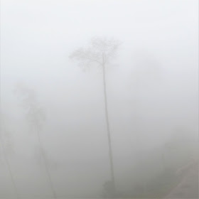
Studies III Color #73 Single Tree in Fog
*
**************************************
Postlude
The World as a Book
Studies III #74 An Old Book
Studies III #75 "Butterfly" Abstract Symmetrical Photograph
The World as a Book ~ News of the Universe
This postlude, entitled "The World as a Book" consists of two images: an abstract symmetrical photograph entitled "Butterfly," and a photograph of an old book. The butterfly as an image is commonly used to symbolize the soul or the mind; in some cultures it is a symbol for rebirth, or the re-emergence of a familiar form but of a higher order after having experienced a transformation while being in the cocoon for some time.
Since the images for Color Studies have been resurrected from old forgotten digital files (cocoons) dating as far back as 2006 it seemed to me the butterfly image is a fitting, symbolic way to conclude this project and serve as transition into the next Studies project, whatever that will be.
Since the images for Color Studies have been resurrected from old forgotten digital files (cocoons) dating as far back as 2006 it seemed to me the butterfly image is a fitting, symbolic way to conclude this project and serve as transition into the next Studies project, whatever that will be.
The book I photographed above was the Qur'an personally used by Bediuzzaman Said Nursi, the beloved Turkish scholar (1878-1960) who wrote Risale-i Nur, a 6,000 page commentary on the Holy Book. His Qur'an had been placed on public display to honor him while I was visiting Istanbul in the spring of 2011. I was struck by the book's beautiful presence when I saw it. This photograph is fairly successful in carrying this presence for me, still.
"The World as a Book" is a concept that was new to me when I first discovered it in my research for the large two year project "An Imaginary Book." The idea is related to the Qur'an which contains the words of God as direct revelation to this world through the messenger-Prophet Mohammad. In the Islamic tradition there is a profound understanding that there is a direct correspondence between the created world and the divine words in the Holy Book. Everything in this created world originates in the words of God, therefore everything in this created world is a sacred symbol of the Divine. To learn more visit this link: The World as a Book
Many visual artists and poets have known or felt or intuited the sacredness of the natural world through their own creative processes, their own experiences of revelation. I have often felt that the work I produced through my creative process did not come from me personally but had its source in a transpersonal creative principle.
We know that the human mind has a tendency to veil or separate itself from the idea of the sacred, and the world as sacred. This in surely evidenced in how polluted the world has become; how individual greed for money and power have become more important than protecting the natural world and its people as a whole.
It seems to me it is becoming a matter of life or death that we learn to see the things of the world as symbols for a transcendent reality. The poet Robert Bly calls these individual revelations of seeing the natural world News of the Universe. Once we have this basic understanding then the difficult but important work that follows consists of interpreting the symbols into terms meaningful to us personally. The very act of interpretation returns us to the symbol's creative origin.
Artists, in their attempts to unveil the sacred mysteries of the world, necessarily must communicate their insights through symbols, that is to say through their poems, paintings, music, photographs, etc. I believe the best of my Studies photographs bring me news of the universe. I hope they do for you as well.
*
I consider the images in Studies III, Color Photographs as preparation and inspiration for new work. At this point in time I only know that I have decided to begin a new project, Studies IV, which will be color photographs made with the specific intention of carrying this initial preparatory work forward. I will discover what that will be as the work unfolds. I trust my creative process. Something will eventually crystallize.
Note: in early September I announced the arrival of the Studies IV project at the top of the Welcome Page of my photography website, in my "Latest Additions" section. The project is a homage to the great Italian still life painter Giorgio Morandi. Visit “Studies” IV: Still Life ~ Photographs Inspired by Giorgio Morandi July 2013 ~ continuing. I will be posting the project's newest work intermittently, in batches. I invite you to keep an eye on "Latest Additions" for the arrival of any new content to the Studies IV project and other possible projects forthcoming.
Thanks for visiting Studies III.
Steven D. Foster
July, 2013
Note: shortly after completing this project I decided to begin the fourth Studies project inspired by the great Italian painter Giorgio Morandi (1890-1964). I invite you to visit Still Life: Studies IV.
* * *
Related Projects:
Welcome Page to The Departing Landscape website which includes the complete hyperlinked listing of my online photography projects dating back to the 1960's, my resume, contact information, and more.


+.jpg)